Top Design Systems in 2025
Sep 28, 2025 • By Ege Uysal
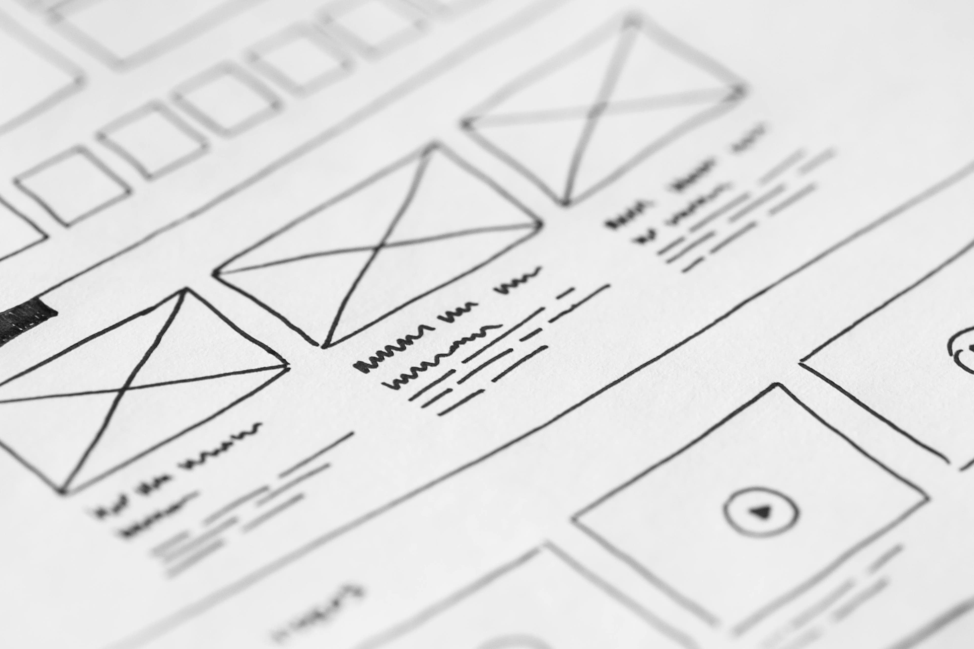
Design systems are basically the rulebooks for modern digital products. They define the components, patterns, and styles that keep everything consistent and usable. In 2025, there are more design systems than ever, but only a few stand out as truly worth talking about.
Here’s my personal take on the five design systems that I think matter most this year, plus a bonus one I’ve been working on myself.
1. Material Design (Google)
Material Design is everywhere. It’s modern, simple, and polished. The guidelines are super clear, and the component library covers almost everything you’ll need.
The only problem? It’s too common. So many apps rely on Material that they start to feel the same. That’s why I don’t really use it in my own projects, even though I respect how influential and well-built it is.
2. Apple Human Interface Guidelines
Apple’s Human Interface Guidelines (HIG) are legendary. They nail down elegance, clarity, and smooth user experiences. Every detail feels intentional, from motion to spacing to accessibility.
The downside is that they’re not exactly a plug-and-play design system. They’re more like principles than a toolkit. Unless you’re designing directly for iOS or macOS, Apple’s look is hard to apply. Beautiful, yes, but not always practical.
3. IBM Carbon Design System
Carbon is built for enterprise-level projects, and it shows. It’s detailed, systematic, and designed to scale. If you’re running a huge product, it helps keep everything consistent and manageable.
On the flip side, it’s definitely overkill for smaller projects. It doesn’t feel as trendy or modern as Material, but it’s solid and reliable. Think of it as the design system equivalent of a sturdy workhorse.
4. Atlassian Design System
Atlassian’s design system is super functional. It powers tools like Jira, Confluence, and Trello, and it really feels designed for productivity. I personally like it a lot.
The issue is that it feels very product-specific. The blue tones and style work well inside Atlassian’s ecosystem, but they don’t fit every brand. I wouldn’t use it for a landing page or marketing site, but for dashboards and team tools, it’s spot-on.
5. Fluent 2 (Microsoft)
Fluent 2 is Microsoft’s updated system, and honestly, it’s a big improvement over the old version. It feels fresh, modern, and clean across different platforms. I love the style and the overall vibe.
That said, I’d personally prefer slightly more rounded corners. Also, since Fluent 2 is still new, it’s evolving quickly. But that’s what makes it exciting to watch in 2025.
6. Bonus: Foundry (My Own Design System)
After experimenting with these big names, I started creating my own design system called Foundry. The idea was to keep things simple, minimal, and developer-friendly without overwhelming you with too much detail.
- Figma file: Foundry Design System
- GitHub repo: Foundry CSS + components
If you’re curious, check it out. And if you like what you see, feel free to email me at hi@egeuysal.com.
7. Final Thoughts
There isn’t one “best” design system. Each of these has its strengths depending on what you’re building. Material is universal, Apple is inspiring, Carbon is systematic, Atlassian is practical, and Fluent 2 is fresh and evolving.
For me, using these systems has been just as valuable as creating my own. If you’re a designer or developer in 2025, I’d say learn from these big systems, but don’t be afraid to build your own that fits your work. That’s where the creativity really comes alive.